Naturally you want to stand out from your competitors, and let your customers know that you're the best! Having a consistent brand identity across all your customer interaction points builds recognition and trust. In a crowded market it gives you the competitive edge.
That's where KhooDesign can help. Our gift is translating your ethos and objectives into a visual identity. Whether it's a business card, logo, or a full brand document, we'll create a visual identity that is strong and reflects who you are.
-
Why use KhooDesign Branding Services?
Building your brand is more than your logo; it's about standing out from your competitors, and being recognised at every interaction point with your customers.
Here at KhooDesign, we’ll design:
- A brand that encapsulates who you are – your ethos, your values, and your unique story.
- A brand that builds trust and credibility through its professionalism and consistency.
- A brand that emotionally connects with your audience to foster loyalty and long-term relationships.
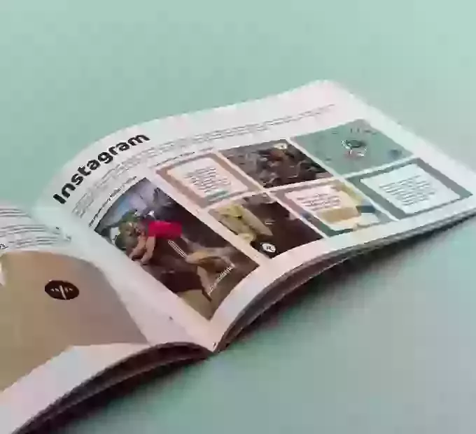
- A brand that is instantly recognisable at every touch point, be that Instagram, TikTok, your website, or a business card.
We’ll collaborate with you to choose colours, fonts, and a creative identity so that your brand is memorable in a busy market place.
Why use KhooDesign Branding Services?
Building your brand is more than your logo; it's about standing out from your competitors, and being recognised at every interaction point with your customers.
Here at KhooDesign, we’ll design:
- A brand that encapsulates who you are – your ethos, your values, and your unique story.
- A brand that builds trust and credibility through its professionalism and consistency.
- A brand that emotionally connects with your audience to foster loyalty and long-term relationships.
- A brand that is instantly recognisable at every touch point, be that Instagram, TikTok, your website, or a business card.
We’ll collaborate with you to choose colours, fonts, and a creative identity so that your brand is memorable in a busy market place.
-
Crafting the visual identity
Our skilled designers and brand strategists collaborate with you to make a logo that really communicates what your business is all about.
Whether it's for your social media, business cards, or anything else, we make sure everything aligns with your brand's personality and values, reflecting who you are and making your business instantly recognisable. This translates into loyal customers, new business, and a consistent message of confidence and professionalism.
-
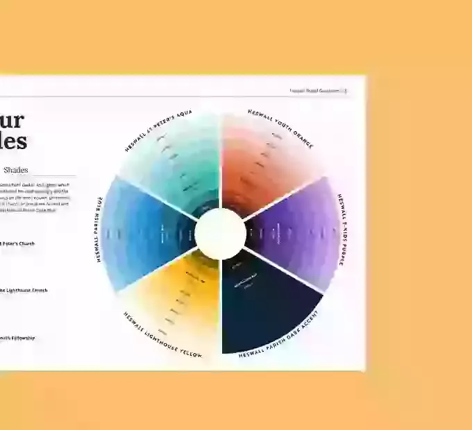
Colours that inspire
Colours speak louder than words. Our branding experts carefully select a colour palette that reinforces your business identity, helping you communicate more effectively with your customers.
Colours that inspire
Colours speak louder than words. Our branding experts carefully select a colour palette that reinforces your business identity, helping you communicate more effectively with your customers.
-
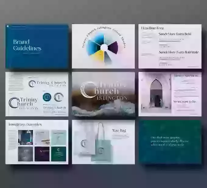
Guidelines for consistency
Consistency in branding is vital for recognition and trust.
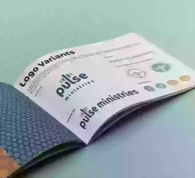
We provide you with comprehensive brand guidelines, including:
- typography,
- colour palettes,
- logo variations,
- social media guidelines, and
- everything you need to maintain a uniform look across all platforms.
This consistency helps in building a strong, reliable brand that customers can trust, ensuring your business is always recognisable and can stand out in a competitive market.
Guidelines for consistency
Consistency in branding is vital for recognition and trust.
We provide you with comprehensive brand guidelines, including:
- typography,
- colour palettes,
- logo variations,
- social media guidelines, and
- everything you need to maintain a uniform look across all platforms.
This consistency helps in building a strong, reliable brand that customers can trust, ensuring your business is always recognisable and can stand out in a competitive market.
-
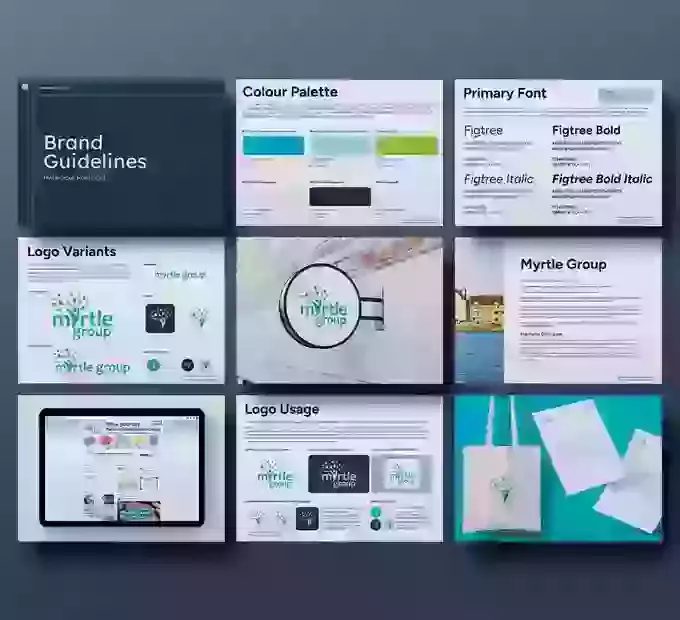
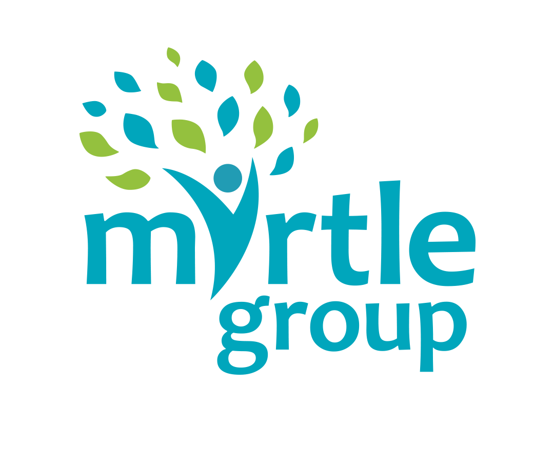
Case Study: Myrtle Group
Myrtle Group is a medical practice formed by merging two GP practices in the Wirral. The word Wirral derives from old English, and means 'myrtle corner'. The challenge was to create a logo that celebrated this heritage.
We designed a unique logo where a person, symbolising the practice, has welcoming arms shaped like tree branches, and wears a 'superhero' cape made of leaves. This figure, also representing a tree, shelters and cares for the community, embodying the practice's caring nature. The graphic forms the 'Y' in 'Myrtle.'
Our branding solution included a simple yet versatile logo with variations for different applications, together with icons adaptable to various media, a specific colour palette, and font recommendations for consistency across all future uses.
-
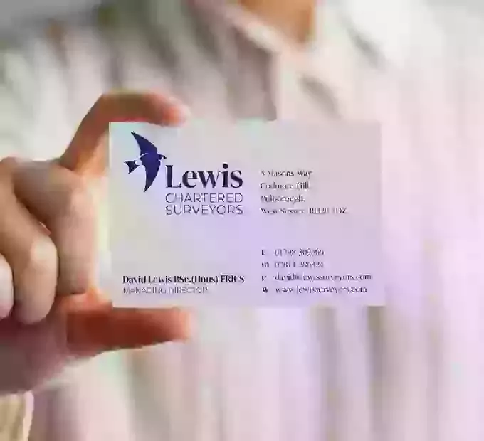
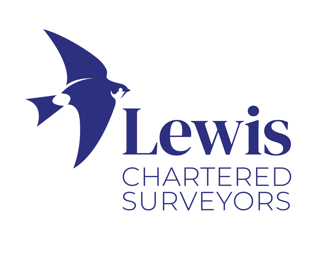
Case Study: Lewis Chartered Surveyors
Lewis Chartered Surveyors, an independent firm based in West Sussex, specialises in providing bespoke, expert advice to help people make the right decisions about their property. Registered with RICS and with decades of experience, they focus on both residential and commercial properties, with a particular expertise in historic and Listed buildings. Their deep understanding of the Sussex and Surrey region, especially the South Downs, inspired their logo design.
We collaborated with passionate bird watcher Andy Ashdown, and included a house martin in the logo. House martins nest under building eaves, and their vibrant blue plumage reflects the brand’s trustworthiness and professionalism. These birds are known for their agility, long migrations, and annual returns which are all qualities that resonate with the firm's values. The choice of a serif font evokes tradition and history, while subtle details in the font keep it modern and legible.
Since launching in 2021, David from Lewis Surveyors has seen significant growth, and we are excited to continue our partnership, supporting their future design requirements.