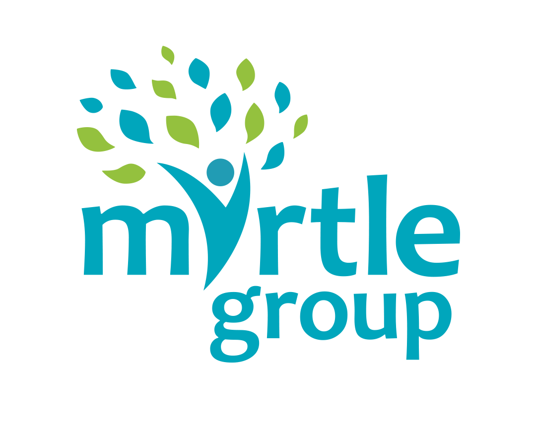
Case Study: Myrtle Group
Myrtle Group is a medical practice formed by merging two GP practices in the Wirral. The word Wirral derives from old English, and means 'myrtle corner'. The challenge was to create a logo that celebrated this heritage.
We designed a unique logo where a person, symbolising the practice, has welcoming arms shaped like tree branches, and wears a 'superhero' cape made of leaves. This figure, also representing a tree, shelters and cares for the community, embodying the practice's caring nature. The graphic forms the 'Y' in 'Myrtle.'
Our branding solution included a simple yet versatile logo with variations for different applications, together with icons adaptable to various media, a specific colour palette, and font recommendations for consistency across all future uses.